Monday 10 December 2012

Record label

There are five major record labels currently in the UK. These are Sony, EMI, Universal, BMG and Warner.

Sony Music 


Sony music is the second largest music corperation in the world. They are a subsidiary label of Sony Corporation of America. Sony Music was originally founded in 1929 under the name of American Record Coperation.
 
Sony manage:
 - Avril Lavigne
 - Chris Brown
 - Westlife
 - Celine Dion
 - Kings Of Leon
 - Beyonce
 - Britney Spears
 - Anastasia
 
Other companies owned by Sony:
 - RCA Records - Alexandra Burke, Miley Cyrus & Kelly Clarkson
 - Columbia Records - Aerosmith & Beyonce
 - SYCO Music - One Direction, Olly Murs & Leona Lewis
 - Epic Records - Avril Lavigne & Cher Lloyd
 
Connections to other media:
 Sony entertainment are linked to many Sony products such as games consoles (Playstation), mobile phones, computers, MP3's and home entertainment systems. By releasing other products Sony's target audience is broadened and they increase the number of their consumers. Sony is also connected to The X Factor, which is a talent show for singers and each year the winner is signed to SYCO, which is Simon Cowells record label.


EMI
 
 
EMI, (Also known as EMI Music) is a subsidiary label to Universal Music Group. Founded in 1931 EMI was originally a private company until 2011. 
 
EMI manage:
 - Kylie Minogue
 - Pet Shop Boys
 - Coldplay
 - Conor Maynard
 
Other companies owned by EMI:
 - Capitol Music Group
 - EMI Christian Music Group
 - Blue Note Label Group
 - Virgin Music Group
 
Connections to other media:
EMI is linked to film, Televisa Music and they even have apps for apple. The also own one of the largest music publications and has own the Music Week Award for Publisher of the Year every year for over 10 years.  Universal
Universal Music Group, also known as UMG, is a subsidiary of Vivendi and was originally founded in 1934 as Decca Records USA.


Universal manage:
 - ABBA
 - Jessie J
 - Jay Sean
 - Gotye
 
Other companies owned by Universal:
 - ABC Records
 - Isolate Records
 - I Scream Records
 - Abbott Records
 - A&A Records
 - Ivy League Records
 
Connections to other media:
Universal are responsible for a number of infamous films includin Jurassic Park and King Kong as well as co developing VeVo. VeVo is a site which is designed for music videos to be streamed via the internet. They in HD quality and ad supported.


BMG:
BMG is an international group of music companies which was founded in 2008, in Germany.
 

BMG manage:
 - Linkin Park
 - Christina Aguilera
 - Maroon 5
 - Justin Timberlake

Other companies owned by BMG:
 - RCA Music Group
 - RCA Nashville
 - BNA Records
 - BMG Kidz

Warner Music Group


Warner Music Group are a major American global conglomerate. They were originally founded in 1958 as Warner Bros.
 
 
Warner Music Group manage:
 - Basshunter
 - B.O.B
 - Cher
 - Jason Derulo

Other companies owned by Warner Music Group:
 - 16th Avenue Records
 - 13th Floor Records
 - 143 Records
 - 13th Planet Records

Connections to other media:
Warner Music Group offer merchandising, sponsorships, brand endorsments and tours to their artists.This increases revenue as well as the artist and brands awareness.

Lyrics to our chosen music video


By analysing our lyrics we have looked further into their meaning and been able to plan and organise each scene carefully. Each scene's visuals relate to the lyrics and some have metaphors and hidden meaning of their own.


(Spoken)
After all you put me through
You'd think I'd despise you
But in the end I wanna thank you
'Cause you made me that much stronger
The opening lyrics of the song are in fact spoken in a low tone and they describe the artists feelings immediately. Not only do they describe how she feels but they also describe how she now feels confident and stronger from all the pain she went through, which portrays a sense of voyeurism throughout the song. The informal use of language ("You'd" and "'cause") not only presents the artists personality but it also shows the familiarity which she had with the person who hurt her which leads the audience to believe she is talking about a lover. 

Well I thought I knew you
Thinking that you were true
Guess I, I couldn't trust called your bluff
Time is up, 'cause I've had enough
This verse explains the betrayal and lying which the artist experienced in her relationship. She talks about how she "thought" she knew him but she called his "bluff" and she "had enough". This shows how she once loved him and trusted him but after his lying she gave up on their relationship.

You were there by my side
Always down for the ride
But your joy ride just came down in flames
'Cause you greed sold me out in shame
This verse again confirms the happiness at the start of their relationship and the security which she felt with her partner as he was always "by her side". However the second part of the verse shows how the relationship turned sour and the fun was over. "You joy ride came down in flames" is a metaphor for the good times in the relationship being over.

After all of the stealing and cheating
You probably think that
I hold resentment for you
But uh uh, oh no, you're wrong
This describes in more detail what went wrong in the relationship and what her partner did to hurt her. She then goes on to explain how his cheating should have made her angry, however she isn't. Her use of language "uh uh, oh no, you're wrong" portrays how confident she is in believing that he doesn't have any hold over her any more.

(Chorus)
'Cause it
Makes me that much stronger
Makes me work a little bit harder
Makes me that much wiser
So thanks for making me a fighter
Made me learn a little bit faster
Made my skin a little bit thicker
Makes me that much smarter
So thanks for making me a fighter
The whole chorus explains how she overcome the hurt and pain and became a stronger person. She sings about the knew traits to her personality and how she is a better person because of it. The line which is repeated twice "Thanks for making me a fighter" is almost a sarcastic dig at her ex partner about how she doesn't need him and she is happier and better off without him in her life.

Never saw it coming
All of your backstabbing
Just so, you could cash in on a good thing
Before I'd realised your game
This verse is about how foolish she felt when she was in a relationship and how naive she was believing that he wouldn't hurt her. The use of language which she uses to describe his lying is dramatic and explains her pain. "Backstabbing" is a strong word and the word "Stabbing" sounds vicious and connotes pain and devastation. Aguilera then claims that he had a "game" which portrays the idea that he had a plan on how to lie to her and control her at the same time so that she was unaware of what he was doing. It also shows how it was just a game to him and that he didn't really care about her feelings or the consequences. 

I heard you're going 'round
Playin' the victim now
But don't even begin feelin' I'm the one to blame
'Cause you dug your own grave
Aguilera is angry at how her ex partner is portraying their break up and making people believe that he was the one who got hurt and lied to. The use of the word "victim" shows the extent of how much she was controlled in the relationship and betrayed. She then goes on to say that she won't take the blame for any struggles he is going through now because he brought it on himself by the way he treated her.

After all of the fights and the lies
Guess you're wanting to hurt me
But that won't work any more
No more, uh uh, it's over
This verse explains how the artist is no longer effected by anything her ex partner does to her. He can't hurt her anymore by lying to her because she is now more confident and has no feelings towards him. She confirms that he used to hurt her as she says "that won't work anymore". The use of the word "anymore" portrays the idea that he used to hurt her when they were together.

'Cause if it wasn't for all of your torture
I wouldn't know how to be this way now and never back down
So I want to say thank you
Again this verse explains how his "torture" has made her a stronger person and she won't give in to anyone who tries to hurt her ever again. She ends the verse with the same sarcastic line "so I want to say thank you" which is a way of rubbing into her ex partners face that by trying to hurt her he has in fact made her stronger.

(Chorus)
'Cause it makes me that much stronger
Makes me work a little bit harder
It makes me that much wiser
So thanks for making me a fighter
Made me learn a little bit faster
Made my skin a little bit thicker
Makes me that much smarter
So thanks for making me a fighter


How could this man I thought I knew
Turn out to be unjust so cruel
Could only see the good in you
Pretended not to know the truth
You tried to hide your lies, disguise yourself
Through living in denial
But in the end you'll see
You won't stop me

This verse shows again the voyeurism throughout their relationship and how naive she was in herself to believe in him and believe he wouldn't hurt her. Aguilera explains how she only saw the good in him without realising that he was betraying her. However she repeats again that he "won't stop" her and she is now a stronger person.
I am a fighter and I,
I ain't goin' stop
There is no turning back
I've had enough
This short verse repeats what the whole song has been saying. Aguilera is reinforcing her point about how strong she is and how she can overcome any struggles. She ends this verse with "There is no turning back" which tells her ex partner that there is no chance of a reconciliation and it's all his fault.
(Chorus)
'Cause it makes me that much stronger
Makes me work a little bit harder
It makes me that much wiser
So thanks for making me a fighter
Made me learn a little bit faster
Made my skin a little bit thicker
Makes me that much smarter
So thanks for making me a fighter
You thought I would forget,
But I remember
'Cause I remember
I remember
You thought I would forget,
But I remember
'Cause I remember
I remember
This last verse is aimed directly at her ex partner telling him that she will always remember what he did to her. This is repeated twice which is effective as it shows how definite it is in her mind that she will never forgive him and be controlled again.

(Chorus)
'Cause it makes me that much stronger
Makes me work a little bit harder
It makes me that much wiser
So thanks for making me a fighter
Made me learn a little bit faster
Made my skin a little bit thicker
Makes me that much smarter
So thanks for making me a fighter
This song is about a long term love and relationship which left the artist hurt and feeling betrayed. Throughout the song she sings about the controlling nature of the relationship and how naive she was to trust him for so long when all along she knew in the back of her mind that he was lying to her. In our music video we are going to use Goodwin's theory and follow the codes and conventions of a pop video. We will links our lyrics to our visuals and tell the narrative behind the relationship.




Saturday 8 December 2012

Planning Lighting

The majority of our lighting is natural lighting to create the atmosphere and build the mood in our scenes. Natural lighting helps portray the emotions of characters as well as the emotions in the lyrics and narrative. This lighting is extremely effective for heightening the sense of isolation in a scene as it is realistic and this is an important part of our narrative.

In the majority of our scenes such as when the narrative about the couple is being shown natural lighting will be used in order for the scenes to be high in verisimilitude. As well as this in scenes outdoors we can't actually alter the lighting and we don't want to do this in the editing process and it makes it less realistic. 

The lighting which we are using follows the codes and conventions of a pop video and relate to the mood of a love song. The lighting options we have chosen will best portray our narrative to the audience and make for interesting viewing to attract out target audience.

Planning Location

The locations which we have chosen to use are :
 - Field
 - Bath
 - Bedroom

These locations create the narrative for our video and link the visuals to the lyrics. 

Field - 
The field represents isolation which is how the artist feels in this song and it links to the lyrics. The isolation shows how she feels without her partner and the sadness she feels inside. A lot of our target audience will be able to relate to the feeling of being lonely and feeling like you're the only person in the world. The empty field will portray the emptiness and the familiar location is high in verisimilitude.

Bedroom - 
In this short scene I will collect a number of old photographs of the couple and tear them up. This will signify the end of the relationship and show me walking away from it. This location was chosen as it connotes closeness and intimacy so it portrays the idea to the audience that they are a couple. This is again a location which the audience can relate to as it is a common environment unlike a stage at a concert.

Bath - 
The use of the bath in our video is as much a concept as it is part of the narrative. In this scene I will be sitting in the bath crying with mascara running down my face and black rose petals surrounding me. The rose petals connote love and a relationship and the black colour of them connotes the end of the relationship. The narrative is the fact that she is crying and portrays the sadness which she feels and the concept is the abstract feel to the scene. It isn't common for someone to sit in a bath surrounded by black rose petals when they break up with someone, however as a concept it is effective. 

We don't actually have many limitations when filming as we have chosen relatively simple locations. The only restrictions we will have is the length of time which we can use the drama studio for at school as there are obviously lessons going on throughout the day. However this is easily solved by filming these scenes after school hours. Apart from this we may struggle to find a field where people aren't around as we need it to be completely empty for it to be effective and we have no right to ask people to leave or move.

Planning Artist Image

Our artist is going to be portrayed positively which relates to Christina Aguilera who is the original artist of the song which we are using. As a group we always knew that this was the way we would present her to the audience and the opinions which we found during our questionnaires confirmed this decision. Our research into music genres has told us that the pop genre means that costumes are feminine and fashionable, so we will be following these codes and conventions. More recently artists costumes have become more provocative and revealing and we found that this is not a popular idea with the parents of our target audience so we have decided against those factors in our costumes. 

Throughout the video I wear three main costumes. The most frequent will be a dressing gown as this is a casual out fit which will represent the naturalistic scenes which explain the narrative. The next costume I will wear is a tight black skirt and peplum top which shows the more glamorous side of the artist and this will be worn each time I sing to the camera. Another costume is a denim shirt which will be worn during the performance based scenes. This portrays the fashionable side to the artists character. The dark colours of all my costumes connotes the darkness of the song and the sadness of the artist.


Our music video can relate to many peoples relationships and struggles which they have been through. The lyrics in the song can relate to anyone who feels like they have been through a time in their life which was hard and they now feel more confident and stronger from it. Therefore the costumes which we chose to use are costumes which are fashionable and which our target audience will like and most probably already wear. This is another way of building a connection with the audience which makes the video more effective.

Photo shoot

It is essential to carry out a photo shoot as the images can be used in various ways to promote the artist and the music. The photo's can also be used to create the artist image and attract the target audience. Anything included in photo's of an artist such as costume, lighting, props and even the location can effect how the artist is portrayed to the audience and their representation in the public and the media. Most artists wouldn't want to be portrayed negatively as this could effect their success in the industry and the strength of their fan base.

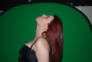
We carried out a photo shoot in order to create a digi pak and a magazine advert for our artist. We decided on the key factors for our photos. The photos had to portray the artist in the way which best represents their music and the album which we had to advertise and promote. We had to consider the costume and poses in the photos as these would attract the target audience and portray the genre of music. In total we took around 100 photos which contained a mixture of poses in two different costumes. 


These two photos were taken for the front cover of our digi pak. When we added them to photoshop we added black rose petals so that it looked like the artist was blowing them away. Rose petals are linked to love and relationships so this is metaphorical of the artist "blowing the relationship away" after she was cheated on. The black connotes how the relationship is over. We chose to use the bottom photo as in the top one my head isn't completely in the frame.
These two photos are also in the digi pak on the inside. We chose a mid shot as it shows the costume and the artists emotions. The artist is facing the camera as it shows her confidence and connects her to the audience. We again chose the second photo as it shows more of the costume and my head is tilted slightly downwards. By tilting my head downwards my eyeline is lifted up and it brings a darker mood to the photo. In photoshop I added the letter "S" to the front of my palm as it is the first letter of the artists name.
These two photos were used in one of my magazine adverts and I decided to use to top one. I decided to use this one as I preferred the costume and the way which my arm is lifted adds a sense of femininity. The pose in this picture relates to the pop genre of the album and the advert and therefore portrays the artist in the best way. 
Although we liked the pose in this photo we didn't think it fitted with the theme of the magazine advert or the digi pak. However we have decided to use this pose in our music video when the artist is singing to the camera.

The above image and the below image were both taken for our magazine advert. In my second magazine advert draft I chose the photo below. I felt that this related to the title of the album "Dimensions" as it shows different angles of the artist. I used this photo in the bottom left of the advert so that it looked as if the artist was looking up at her name which was written across the top of the advert.

We took these photos to show the glitz and the glamour of the costumes. Our artists target audience if young girls and every girl loves a pair of high heels. We decided to use the bottom image in the digi pak as it added more movement as the artist is walking towards the camera rather than simply posing.

Planning Cinematography

Cinematography is the camera shots which are used in each scene. Audiences don't usually look into the shots used in a music video, however they are extremely important as they effect the storyline and the meaning of the video without viewers realising. Throughout our video we will be using a variety of camera shots in order to create the atmosphere and tell the story.


Close Ups - 
Close ups display facial expressions and objects which are important to a storyline. Close ups can create the mood in a scene and present vital information to the audience. For example in the image below Christina Aguilera is smiling which portrays her happiness in the scene and relates to the genre of the song. The angle of the close up is to the left and she has turned hey eyes in that direction which brings more focus to them. In this song Christina is singing about her lover and the way which she is looking into the camera and the angle of it adds to the sexual nature of the song. Throughout our video we will use close ups to show emotion when singing into the camera and the angry facial expressions during the scene where the couple argue. Using close ups during these scenes will relate the lyrics to the visuals as it will create the mood.

Mid Shot - 
The use of mid shots in our video will portray the characters body language as well as establishing their facial expressions and surroundings. By showing the characters costume and body language it adds more meaning to the scene's and shows emotion to the audience which helps tell a story. Mid shots are extremely important in our music video as the costumes have a lot of connotations and represent a number of key factors to our story line, such as the emotions we feel as characters. We also use mid shots to show the body language between the couple as they argue in order to show the anger and frustration which has built between them.

Long Shots - 
Long shots are commonly used to show a characters entire body to the audience, from head to toe. Our long shots will be used to show the artist walking across fields and a road. This will be effective as it will show the journey which the artist has been on.

Extreme Close Ups - 
This type of shot is simply a close up which is even closer. They are used to define smaller details to the audience. A common use of an extreme close up is when only a characters eyes are in the frame which shows their emotion and builds the atmosphere of a scene. We will use extreme close ups to show old photographs of the couple when the artist sets them on fire in order to make it clear to the audience. Showing the photographs as an extreme close up will also show the audience that the couple were once happy and in love.

The variety of shots which we have chosen to use will keep out music video interesting and attract the audience. As well as this we have chosen carefully which shots to use as we want there to be meaning behind them and for the shots to portray the emotions and mood in each scene. Mid shots will be extremely important in portraying emotions and hidden meanings as they show costume and facial expressions as well as body language.

Thursday 6 December 2012

Planning Iconography

Iconography is used in music videos to create the characters and help build the atmosphere in scenes. A lot of iconography makes a music video feel more realistic and helps tell a story or represent an idea to the audience. The use of iconography in videos portrays the genre and style of the video. Planning iconography is extremely important as it must conform to our genre and what we are trying to portray to the audience. 


The black rose petals will be used in a bath to create a dark atmosphere. The black petals will tell the audience that the love she once felt for her partner is dead. The colour black connotes death, sadness and grief. These are all emotions which the artist portrays in our music video.


These candles will be lit up around the bath to create the low key lighting in the scene. The black colour of them relates to the dark genre and theme throughout the video and also create an atmosphere. In this scene I will be sitting in the bath with mascara running down my face and surrounded by black rose petals. This scene is all about how a loving relationship turned sour and left the artist broken hearted.  


Analysis of magazine adverts

Magazine adverts are essential to promote an artist and their material. Every album which an artist releases will show some change either in the way the artist looks or the way in which they present the album itself. This shows the progression throughout their career as well as the need for change in order to keep the attention of the target audience. This advert was in magazines in 2006 to promote Christina Aguilera's "Back To Basics" tour. 


Representation of the artist - 

The advert demonstrates a positive representation of the artist as she can be seen as a role model to younger girls, however she can be seen as slightly provocative. She is shown to be a feminine and sexy young woman and the image is simplistic. Aguilera isn't shown to be doing anything negative or influential such as drinking, smoking or promoting a party lifestyle. Aguilera knows her target audience and she also knows her fans and how she wants to be portrayed to them and the media. The low key lighting adds to the sexual nature of the advert and makes the image of the artist appear more provocative. There is a sense of mystery in the image of Aguilera as she isn't giving too much away to the audience in her facial expressions. She is simply looking down at the camera and standing against a wall. This could be appealing to the target audience as they would want to know what the advert was about and what Aguilera is promoting. Overall the advert represents Aguilera in a mostly positive light, other than the way she is dressed. 

Connotations of the advert/Colours and connotations - 

The colours in this advert attract the audience immediately as they are simplistic and show a change in Aguilera as an artist. The pink colour of her shirt represents femininity and shows a change from Aguilera's previous videos and style which was a lot darker in videos such as "Fighter" and "Beautiful". The pink along with Aguilera's pose shows the change she is making as an artist and connotes the genre of her music and style of her tour. The connotations of the black show perhaps a dark side to her new music. The songs on this tour were mainly about love which links in again to the pink colour and the black could represent the sadness in those love songs. Aguilera is alone in the image which could connote the power in her character and how she is unique. Most of the songs in this tour are about Aguilera being her own person and fighting for what she believes in which relates to the image of her standing on her own and her strong stance. The simplistic background and theme of the advert also relates to the title of the tour "Back to Basics". Aguilera is going back to her routes and concentrating on the music rather than the glitz and glamour which comes with it. 

Design/Layout - 
The long shot of Aguilera establishes to the consumer that she is the artist and the advert is entirely about her. Along with this her pose is welcoming and strong. The simplistic design of the advert tells the audience a lot about what is being promoted and what they are buying into. The design of the advert is easy for the target audience to relate to as it isn't anything especially glamorous or celebrity driven. Aguilera is simply standing there and there is a plain background, which people can relate to. The average target audience wouldn't be able to relate to a picture of Aguilera on stage or sitting in an expensive convertible. The image of Aguilera isn't central which makes it different to other adverts where the artist is the focal point. This portrays the idea to the consumer that the tour is more about the music than just Aguilera herself.  

Choice of images - 
There is only one image in this advert and it is of the artist. The image is a long shot which presents Aguilera in full to the audience which connotes that she isn't holding anything back or hiding anything. The name of the tour "Back to Basics" relates to this image as Aguilera is going back to her routes before all the fame and fortune and before factors such as her image became more important than the music itself. The image shows Aguilera's confidence in herself as an artist and her new image. Her outfit and her hair style show diversity to other artists as most artist wear tighter and skimpier outfits. Aguilera's signature look is the 1950's hair styles which makes her recognisable and unique from other artists.

Typography - 
The typography used in this advert is clear and precise. The font is large yet feminine in order to keep to the genre of the tour. Aguilera's name is central and bold in order to catch people's attention. It is written in white which contrasts against the black background in order to stand out and be easily read. White is also the colour which represents purity, heaves and perfection and this relates to how Aguilera is being portrayed. Her name is also in capital letters which makes it clearer and this ensures that it will be the first thing that the consumers reads. The title of the tour is written in a feminine swirly font which relates to the artists image. It isn't extremely large in size as the artists name is the focal point along with her image. It is written in red which connotes love and the sexual nature of Aguilera's personality. 

Style of language - 
The purpose of this advert is to inform the consumer about the tour and promote it. Although there is not a lot of language included, the language chosen works effectively in order to catch the audiences attention. It says exactly what the audience need to know without too much added language. This catches the consumers attention as it is easy and quick to read. 


The above image shows the artists name which is central in the advert and eye catching. The artist isn't introduced on the advert and nothing is said about her other than her name which attracts the audience as it is quick to see.


Again in the name of the tour there is no conversational language used to introduce it or describe it. Only the name of the tour is shown which simplifies it and makes it clear to the audience what is being promoted. Usually people prefer not to read long sentences and paragraphs on an advert and the shorter and more precise the language is the more effective it is.


The use of simplistic language in "Sony Ericsson and Orange present" informs the audience who is sponsering the event. This is shown on the advert for legal reasons and if therfore not considered vital information for the consumer. The formal tone of the language tells the consumer that it is not information about the tour itself.

How does the advert promote the artist -
This advert portrays Aguilera in a different way to her previous image in the media. At this point in her career Aguilera had changed her style in music as well as her own style in how she looked. She looks feminine and innocent as well as showing her more sexual nature by her pose and outfit.

How does the advert promote the music genre -
This tour contains all the music from Aguilera's recent album "Back to Basics". The genres on the album include pop, RnB, jazz and blues. The colours of Aguilera's clothes represent the pop genre as they a feminine and bright. Her hair and make up portray the jazz and blues style of her music with her 1950's style. There is a combination of different genres in this advert and they are represented by the use of colour, costume and lighting.

How does the advert attract the target audience -
This advert attracts the audience through its simplistic nature and laid back feel. This appeals to the audience as there isn't too much to look at or read and it portrays the idea that the tour is all about the artist which would appeal to the target audience. The image of Aguilera is a long shot which shows the audience that she isn't hiding anything and her feminine style is iconic to the consumer and young girls.


I have chosen to analyse Britney Spears' advert for her tour in order to compare it with Christina Aguilera's and look at the different ways in which they promote themselves. Both of these artists are the same age and their music is the same genre. I chose to analyse similar aritsts as it shows different ways of promoting similar genres.

Representation of music artist -
This advert demonstrates a positive representation of Spears. Like Aguilera she is shown as a feminine young woman who also has a more provocative side to her. Also like Aguilera, Spears isn't shown drinking, smoking, taking drugs or promoting a party lifetsyle which makes her a good role model to younger girls. Her outfit ties in with the theme of the circus for the tour and shows her more sexual nature as it is tight fitted and short. Spears looks really happy in this advert as she is smiling and her open arms make the tour seem fun and welcoming. The low key lighting again like Aguilera's adds tot he sexual nature of the advert.

Connotations of the advert/Colours and connotations -
The colours used in this advert attract the audience as they contrast eachother which makes them stand out and look sharper. The white colour of Spears' dress connotes possitivity and perfection. At this point in Spears' personal life she was recieving a lot of negativity from the media and these colours represent her happiness and ambition to be positive no matter what. The darker background adds mystery to the advert, just like in Aguilera's, which also relates to the theme of the circus. Also like Aguilera, Spears appears alone in this advert and holds a very confident pose, which connotes her power and the strong stage presence which she possesses. The circus tent in the background clearly relates to the title of the tour, however it connotes the saying "Life is a circus" and this portrays how Spears felt at that point in her life. It shows how all the media and show business feels like the same crazy atmosphere of a circus. As well as this it also shows how Spears at times puts on a show, like a circus, even though she may not be feeling completely confident and positive in her personal life. The bubbly side to Spears' personality is shown in the image of her as well as the background which relates to the pop genre of her music.

Design/Layout -
Like Aguilera's advert the long shot of Spears shows the audience who the advert is about and establishes her as the artist. Although this advert is simple it is not as simple as Aguilera's. The circus tent in the background ties in with the theme of the tour. However like Aguilera's advert, this one doesn't contain anything which the audience can't relate to. In fact the whole idea of the circus would excite the target audience who are mainly young girls as they can relate to the love of dressing up in costumes and putting on a show. The image of Spears is central which portrays the idea that the advert is entirely about her and her tour.

Choice of images - 
There is again only one image in this advert and it is a long shot of Spears. The long shot not only shows her costume which fits into the theme but it also portrays the idea to the consumer that Spears is the focal point in the advert and the tour. The name of the tour relates to the image of Spears as her arms are open wide and she is portraying the character of a ringleader in a circus. Her arms being opened wide is welcoming to the audience and they move the audiences attention to the writing "The CIRCUS Starring Britney Spears." The image shows Spears' confidence whilst portraying this character and her facial expressions show her happiness. The choice of images show a sneak peek of what the consumer can expect to see in the tour.

Typography - 
The typography in this advert is bold and eye catching. The font is feminine to relate to the artist, however the colour attracts both men and women and it also connotes strength and power. These are the two traits in her personality which Spears is trying to show the audience and the media after the negativity which she always receives. The artists name is central and the biggest font on the advert which is effective as it is one of the most visible things along with the artists image. The title of the tour is in capital letters whilst the rest of the sentence isn't which also makes it stand out more. "The CIRCUS Presents...", this makes the name of the tour more memorable. 

Style of language - 
The limited use of language portrays the importance of the images and this makes the advert more effective as they words used are more memorable. 


The first sentence "The CIRCUS Presents" is quite formal as Spears is being portrayed as the ringleader of a show and it looks professional. 

The artists name is written simply which is memorable and recognisable to the target audience.

The support act are introduced as "Special guests" which makes them seem really important and describes them as a really enjoyable and talented act to see. 

How does the advert promote the artist - 
This advert portrays Spears differently to what her target audience and fans are used to. With every album and tour that Spears has she has a new style and the circus style is clearly shown in this advert. Spears looks feminine as well as provocative through her choice of outfit in this advert. Her facial expression is happy and welcoming which portrays her positively to the audience.

How does the advert promote the music genre - 
This tour contains all the music from Spears' recent album "Circus". The genres on this album include pop and dance pop. Spears' facial expressions and feminine outfit in this advert promote the pop genre and the glitzy lights in the background relate to the dance pop. The femininity in this advert strongly portray the pop genre of the tour.

How does the advert attract the target audience - 
The advert attracts the audience through it's use of appealing to the audiences interests. Spears' knows her target audience are mostly young girls who all love the glamorous lifestyle of being a pop star and dressing up. This advert portrays the idea to young girls that being a singer is fun and you get to dress up and look pretty which appeals to them. 

This research will help me when creating my own advert as they show how to relate to the genre and portray themes and ideas to the audience. I have learnt that a simplistic advert is extremely effective in order to attract the audience and it can still convey the codes and conventions of the genre.